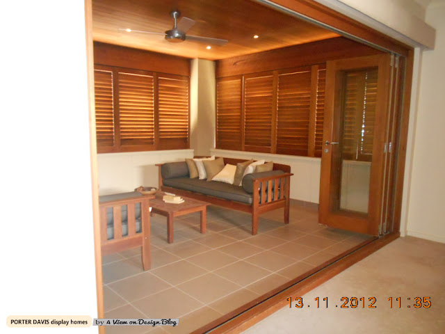
Part One - Porter Davis Homes Haven
I had to break this post up into a few posts because I went through so many display homes the other day, and it was so hard to pic which photos would go on this blog, but for now, these will do! The next post will have Metricon Homes!
Porters, we all know, in Australia do beautiful display home fit outs. If you are in any doubt whatsoever go see their website, and click on the "Homes" bottom Pop up Menu and select "style finder".
Then come talk to me.
I decided to this pic first (below), because it was in one of the Porters display homes at Saltwater, and clearly, it's odd. But I liked that. It was different, I guess it's hard to make so many display homes look different.
I've blogged about Porter Davis Display Homes before over here.
We all know what it is like to go through a display home and find the furnishings look dull, unappealling... Well Porters could never be accused of that. I give them 5 stars!
Here's a selction of some the pics I took the other day...
Make sure you tell me what you think too and Tweet it by clicking here.
Oh, and before I forget, please sign up for posts in the new
email sign in box to the right of this post,
I want to get rid of Feedburner! Thanks!
OK, so here's my living room snaps - sorry about the quality of the pics,
I took them in a rush so the staff wouldn't tell me to stop!!!
(cmon, we've all been there... :) LOL


I loved the little details in this home, like the panneled doors!

This study greeted you as you walked into this home - very charasmatic!

OK, so let's get into kitchens.
They were all above average, but I found Metricon's kitchens just a bit better,
the little details.... Still, the following ones were still beautiful!

Bedrooms
In no particular order,
but of course, I only took pics of the ones I liked,
there were so many to choose from... yum!
It would be hard to go past this bedroom, with a boat - yes a boat,
with drawers underneath and all!
The wallpaper was also nautic, and although it looks a bit odd in this pic,
in real life - it looked amazing!!
Porters have mastered the Master Bedroom!
Soft wallpaper, bold bed furniture,
lotsa beautiful cushions
(no kids crap around the floors)
ah yes, bliss!!!
Honestly, these bedrooms look way more spectacular in person than in my photos!
Amateur photos with cheap camera!
what can I say, I'm a professional... LOL
OK - so what's an outdoor setting doing in the bedroom collection you ask?
Well, that my dears, is the "parents retreat" upstairs, off the master bedroom.
It appeared to be air tight, and obviously being a balcony,
it looked amazing - so different - I want one NOW!!!
I didn't photograph many bathrooms,
you've seen one, you've seen them all.
But I did like the colours in this bathroom, and
the tiled bath edge!
The above would have to be my favorite bedroom.
Don't forget to TWEET This Post too, if you like Porters Pretty Displays as well!
No, Not much outdoor shots either,
it was just interiors that took my fancy that day!
:)
Annie (Kate) Luella


0 comments:
Post a Comment